Remembering the Migrants of
Quintana Road
Overview
Designing an award-winning zine grounded in Latin American archival research to honor 53 migrant lives.
Services
Editorial
Role
Design Lead
Timeline
Jan - Jul 2026
Tools
Adobe Creative Suite
Canva
Overview

zine design, cover to timeline.
In 2022, dozens of migrants from South America died in an abandoned trailer outside San Antonio, Texas.
Mass media generalized these people into mere numbers: "53 victims."
As part of the Undergraduate Research Apprenticeship Program, our research team spent a semester
recovering who they were beyond those numbers, tracing their lives and relationships.
My job as a Design Lead was to give that research a visual identity in the form of a public zine.
Design Process

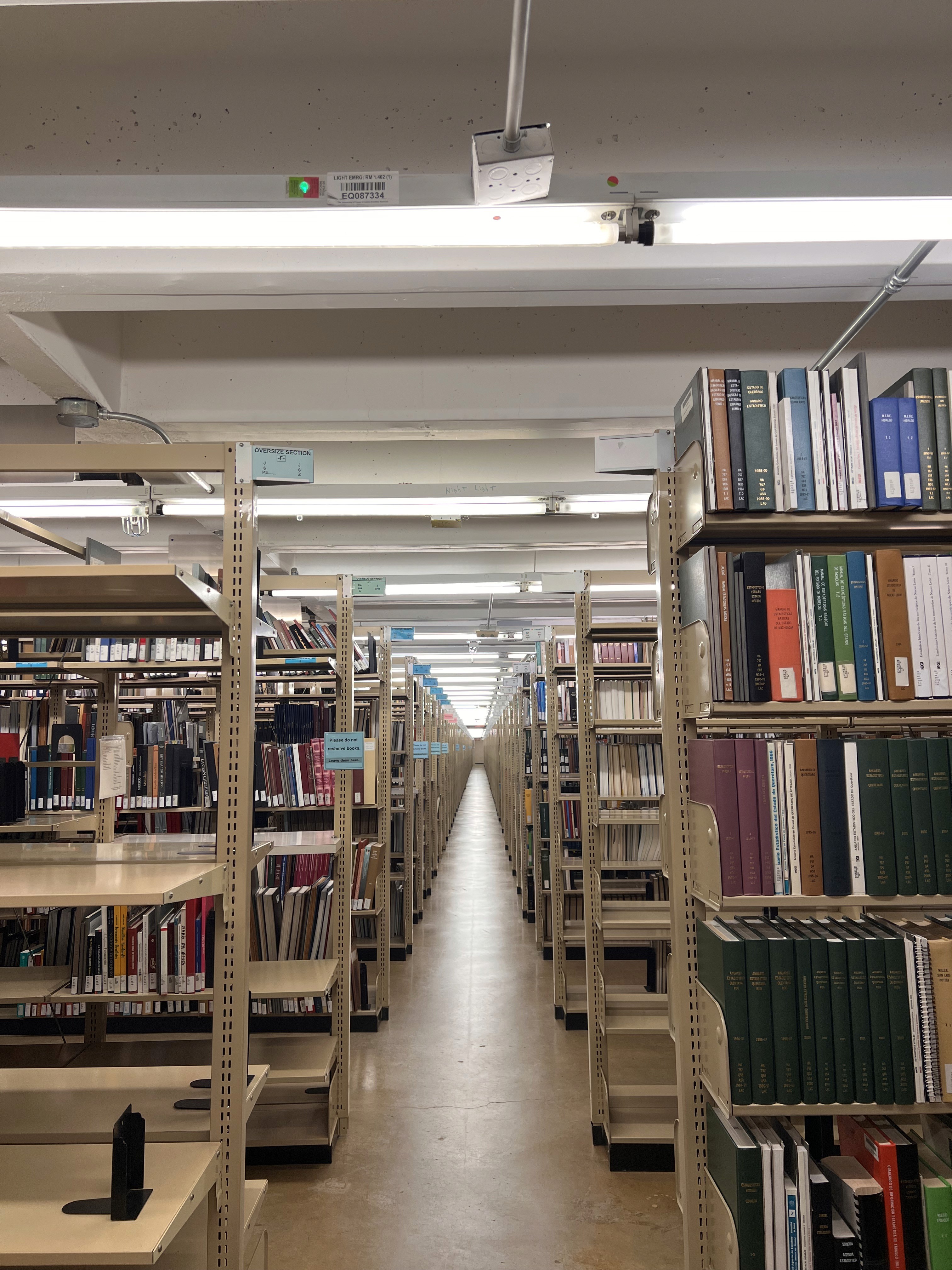
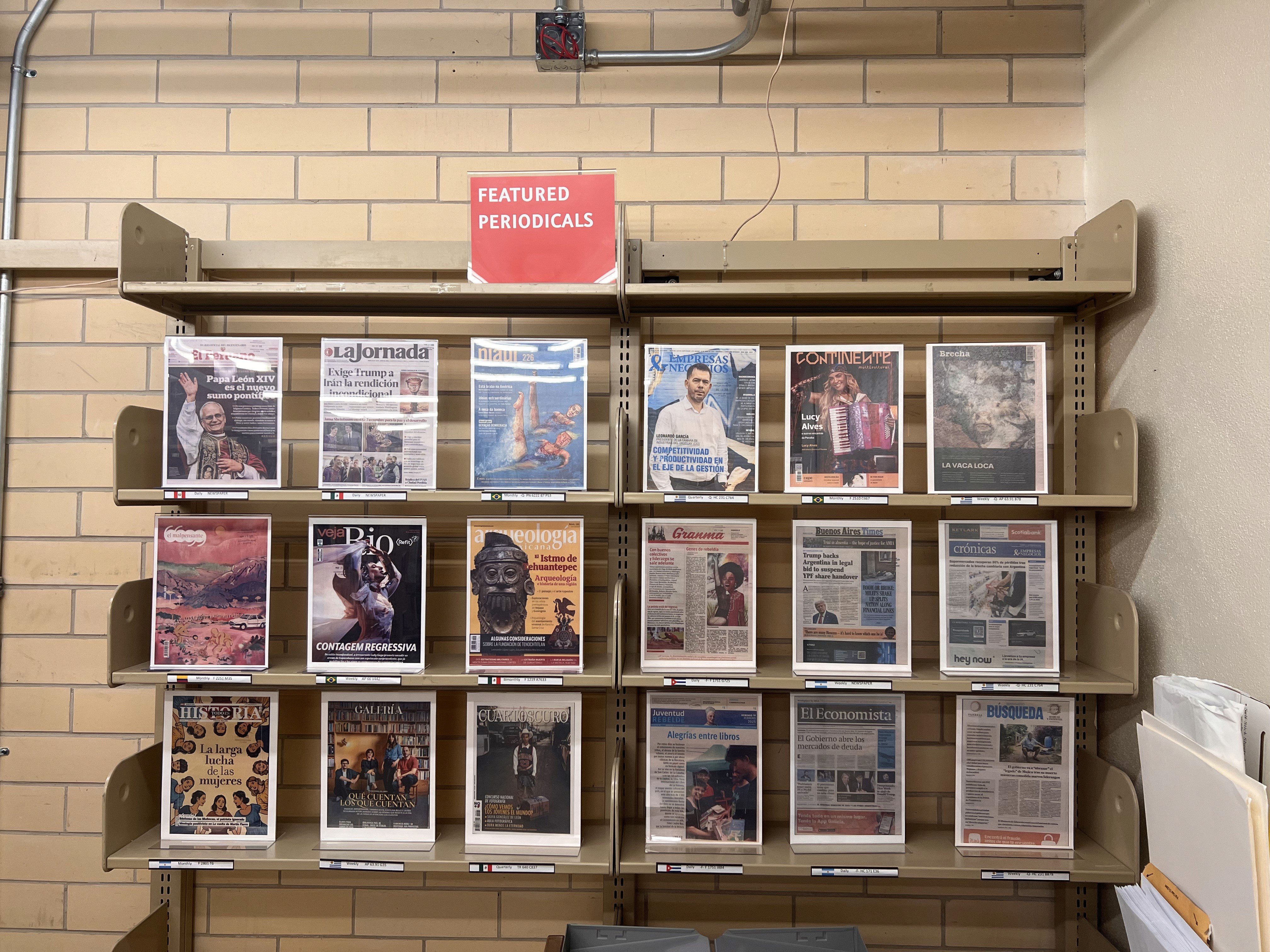
The Benson Latin American Collection at the University of Texas at Austin.
Before ideating for the actual design direction, I visited the Benson Latin American Collection, which consists of
"original manuscripts, photographs and various media related to Mexico, Central and South America, and
the Caribbean and Latina/Latino presence in the United States."
Rather than scrolling through Pinterest, I studied authentic historical resources and artworks to create
a visual identity that resonates with the cultural world the victims came from.

Image of my sketches from Benson.
My analysis at the Bencon Collection allowed me to establish a deep understanding of the Latin American people,
culture, and visual language. Particularly, I was able to find a common design direction among zines that carried
historical and political content, which then became my guidance for this project's visual identity:
Bold, Sans-Serif, Condensed Typography
Warm, Earthy Color Palettes
Black-and-White images with Rough Texture

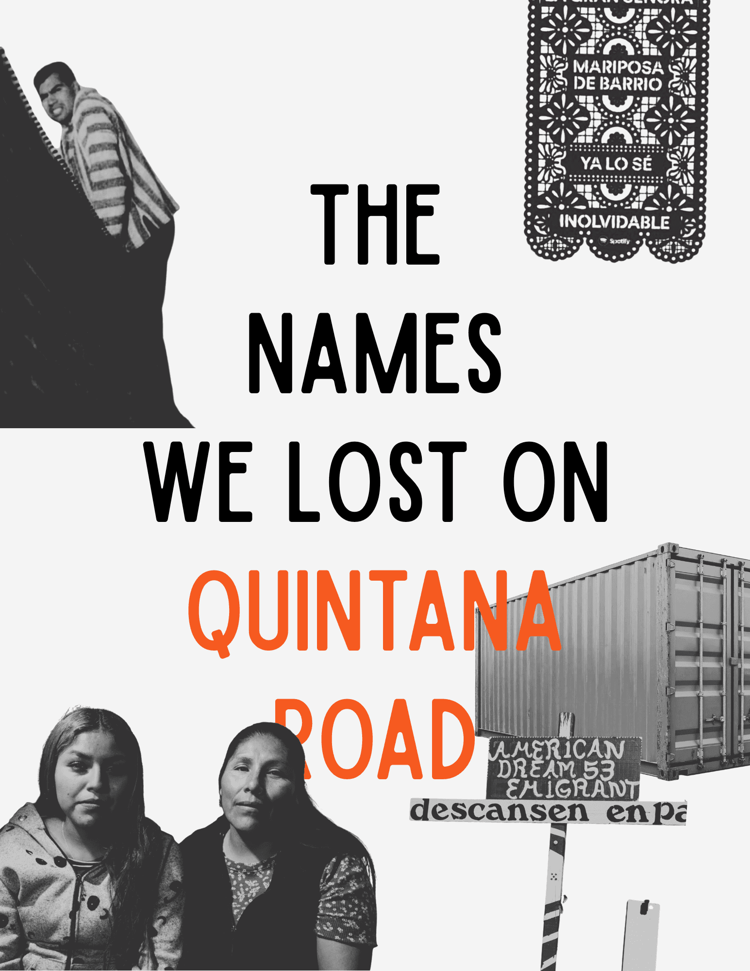
1) Initial design direction presented to my research team
2) First low-fidelity design draft
3) Round 3, after feedback from the RAs and readers outside the project.
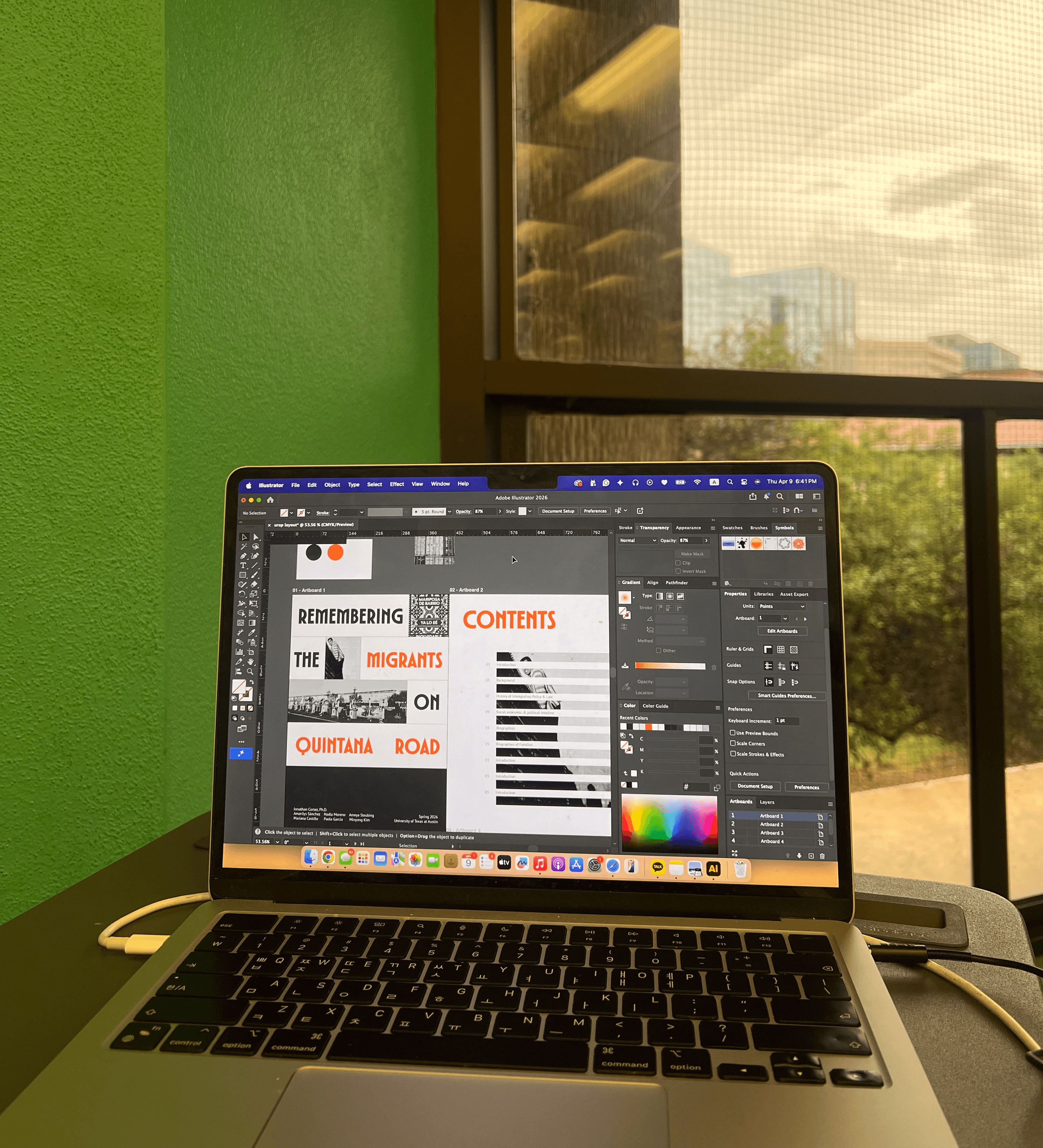
Final Solution


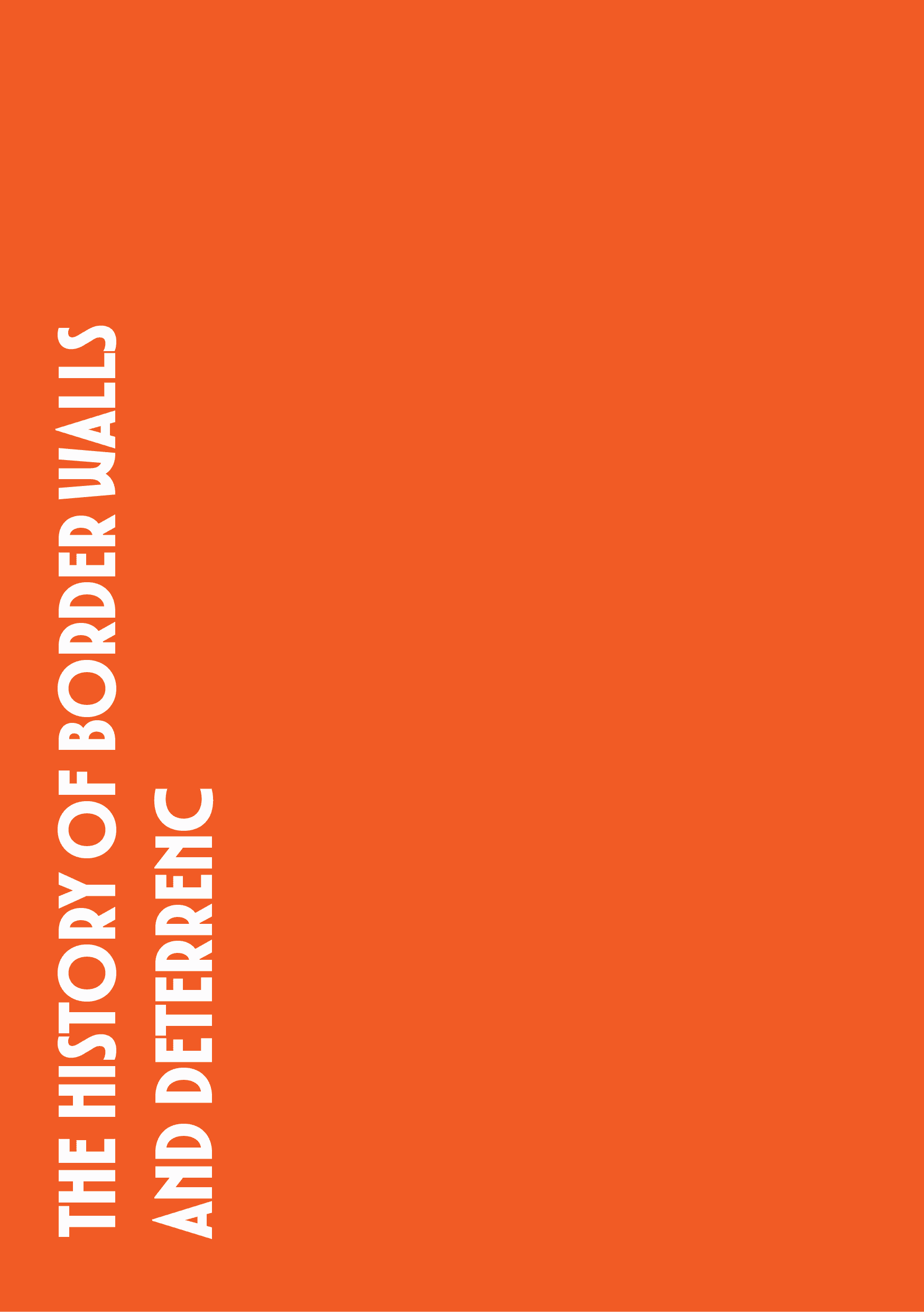


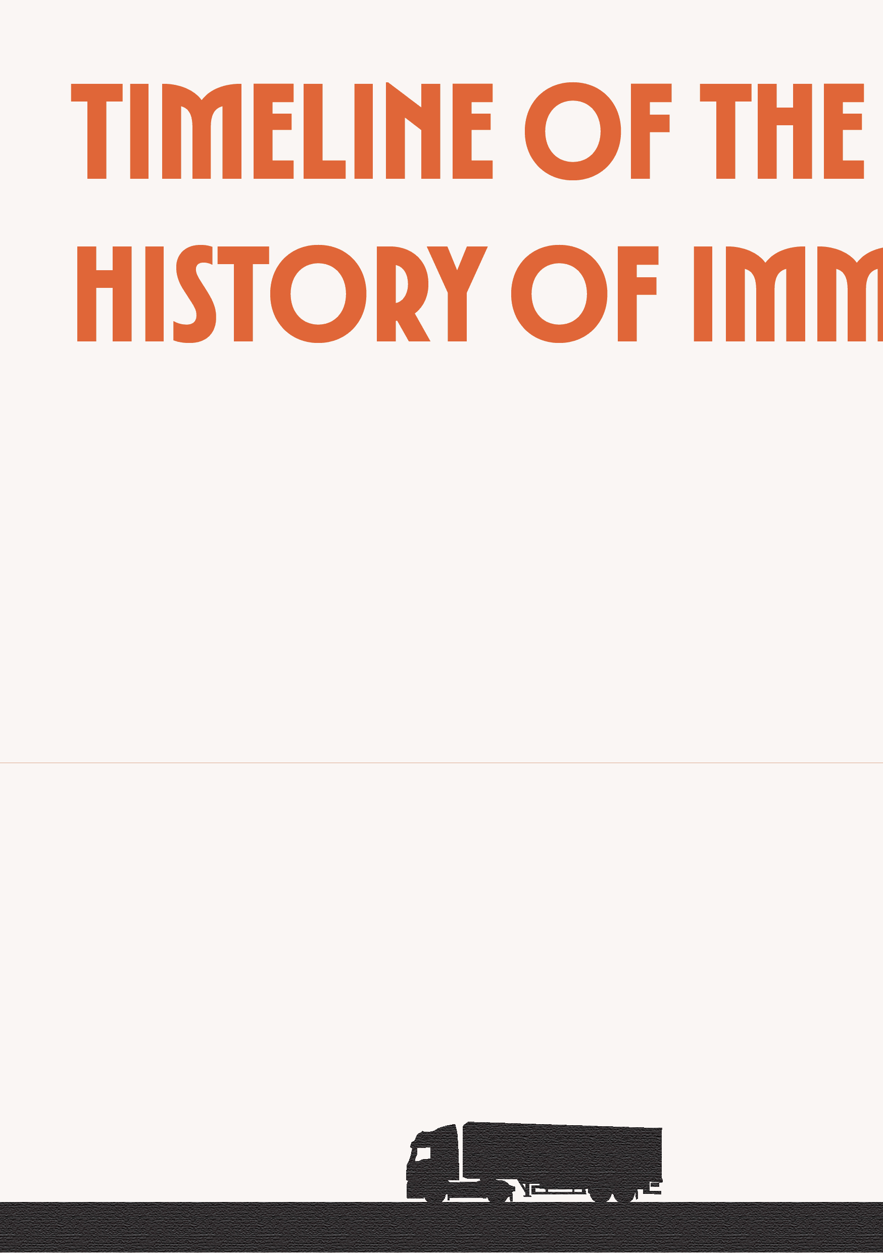

Preliminary Layout, content currently under academic review
Built with deliberate restraint, the visual identity uses a two-color palette, a single title font, and minimal illustration.
I intentionally avoided red, a color often used in political zines, to avoid evoking feelings of danger or guilt.
Instead, orange and charcoal were used. Orange sits closer to warmth, to earth, to the tones you find in
Latin American folk art and textile work, and is serious without being cold.
The condensed typography lets us set large, impactful headlines in limited space and carries a kind of urgency
without being aggressive. I also incorporated the long tradition of condensed typography in protest graphics
and documentary print work.
Impact & Results
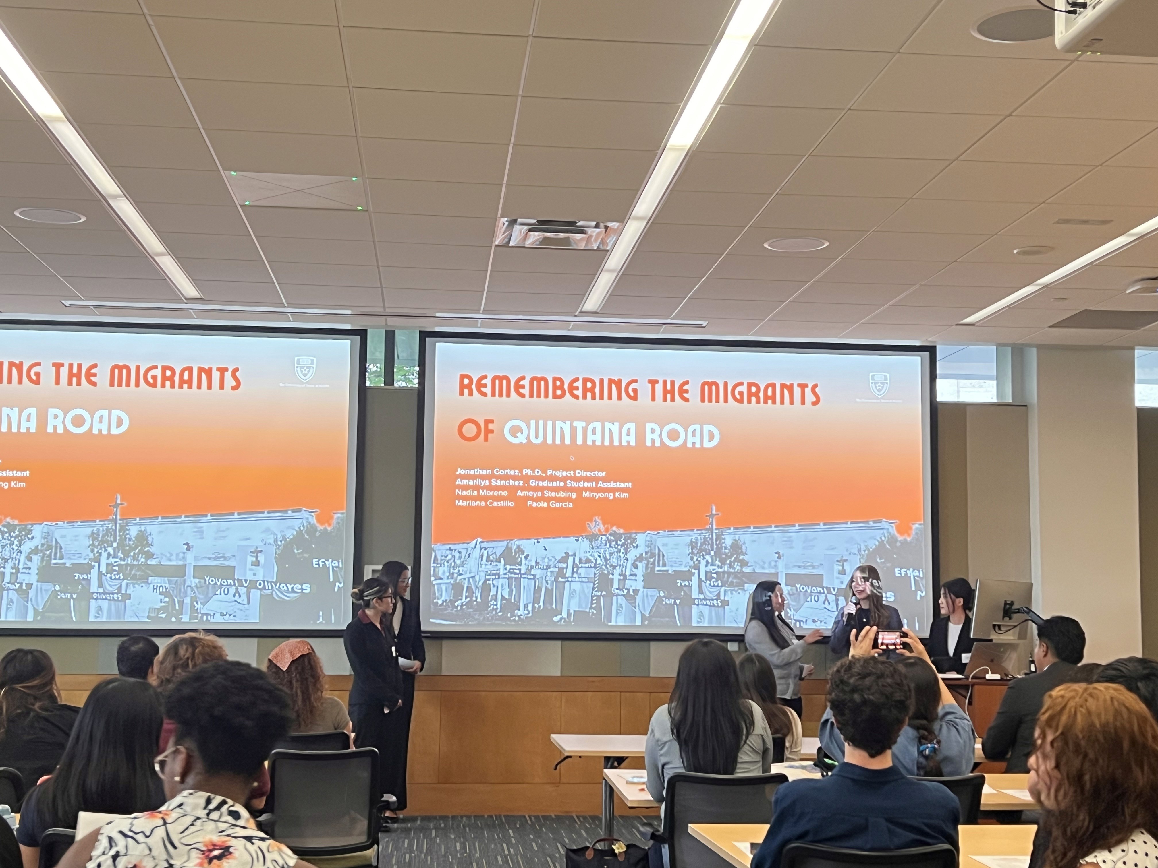
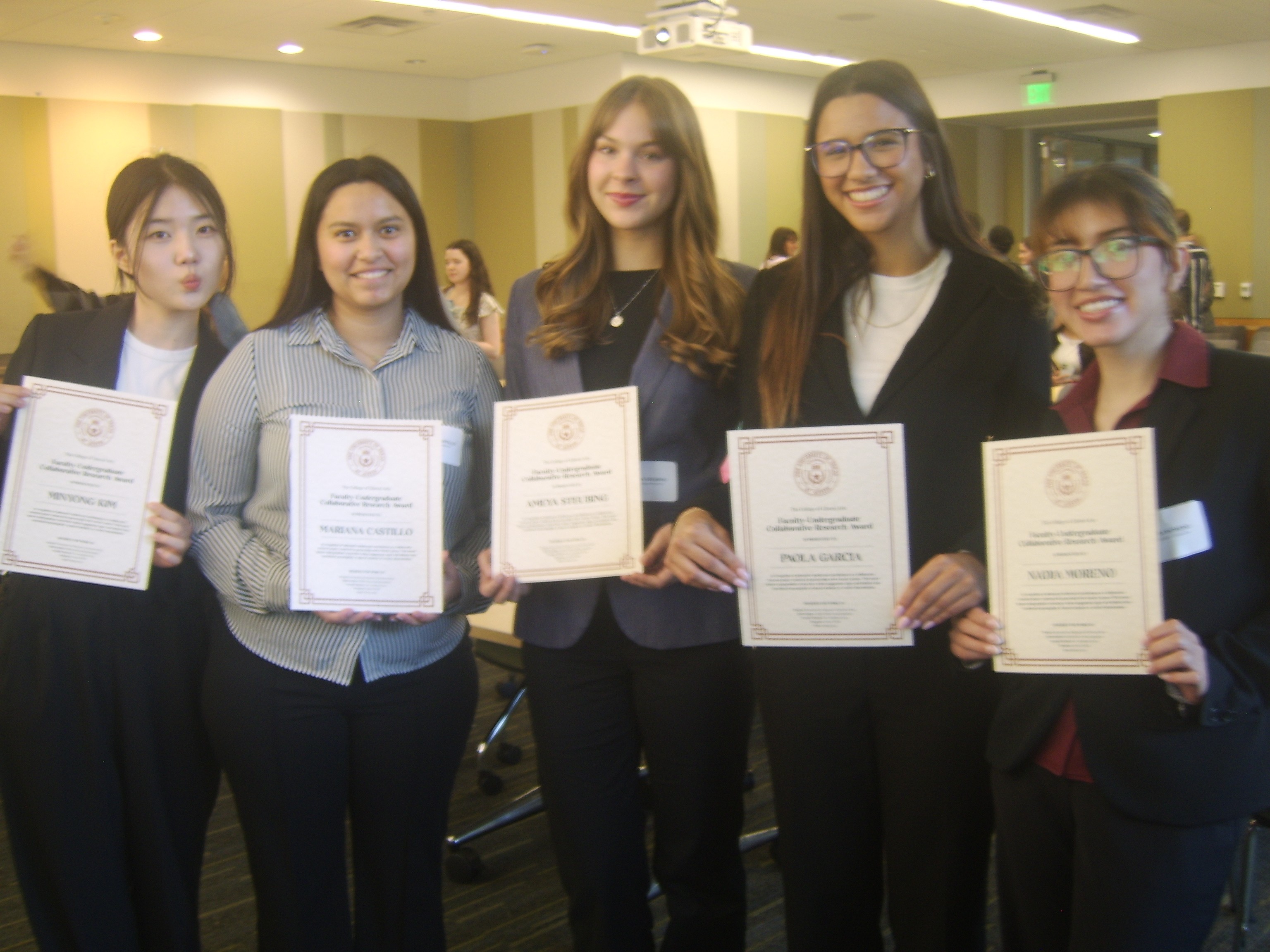
2026 Undergraduate Research Apprenticeship Program Symposium.
Our project was presented at the 2026 URAP Symposium and was the only research team out of
11 undergraduate teams to be awarded the Faculty-Collaborative Research Award.